Photography
Visual identity guidelines
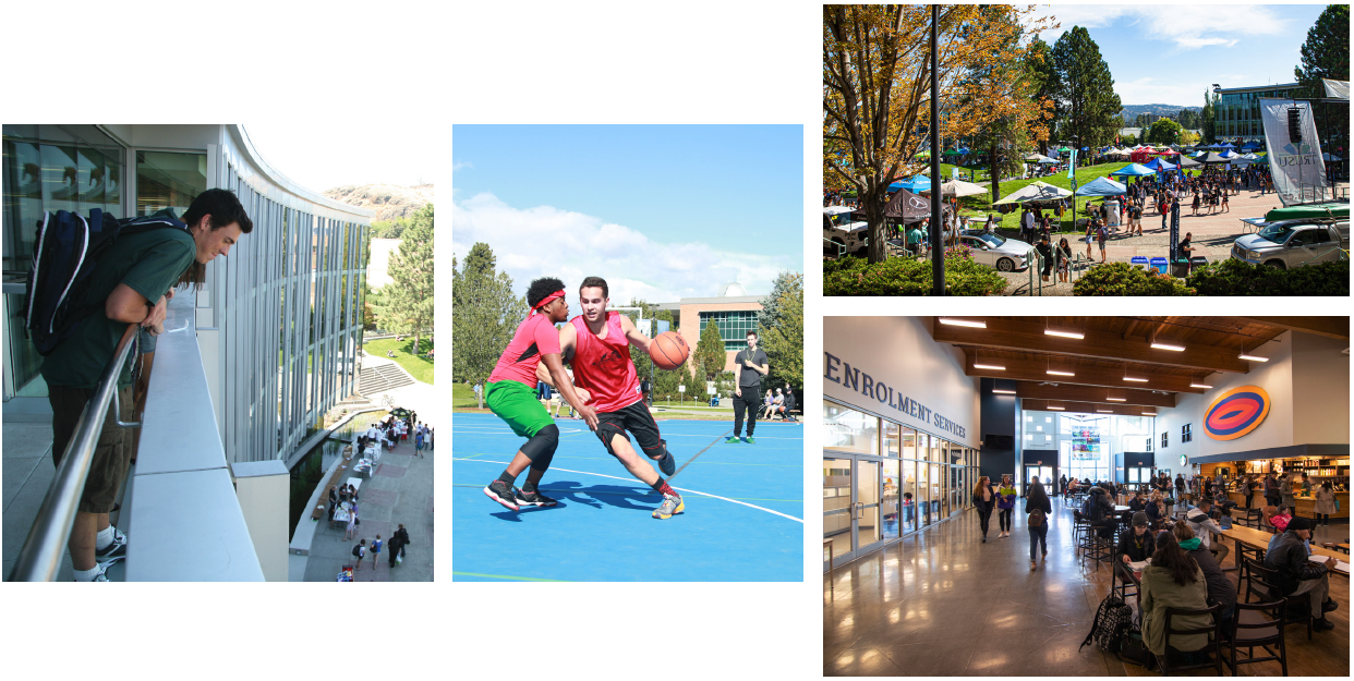
View these guidelines with more examples in our pdf document here. Here are some examples of TRU photography on our Flickr account.
The ideal TRU photo reflects authentic TRU experiences, tells a story, and inspires viewers. It is honest, bold, eye-catching and candid. Our photos fall into three broad categories: people, places, and details.
People
Photos of our students, faculty and staff tell the story of TRU’s diversity, opportunities, and community. Strive to take photos that represent the spectrum of diversity at TRU. Be sure to take gender, ability, age, and cultural diversity into consideration.
- Take photos with subjects engaged in conversation, engaged in learning activities, or moving through the campus environment—e.g. a student presenting in the classroom, working in the lab, studying on campus, talking with classmates, interacting with an instructor, or walking through campus spaces.
- When possible, set subjects in a location that gives a sense of place—e.g., in a room with artwork or an outdoor space with distinctive architecture or landscape.
- Whenever possible, capture subjects in activities that could represent career outcomes in their field of study. Show activity as it would happen in real life. (e.g., subjects wearing appropriate safety gear and following procedures that they would in the real world).
- Quiet, contemplative moments are also important. Subjects do not always need to be smiling, laughing or talking.
Examples of People

Places
Images of distinctive campus spaces tell the story of TRU’s unique location, beautiful campuses, and impressive learning spaces.
- Try to include people in the photo, even if they are in the distance or are not looking at the camera.
- When possible, include natural landscape features of campus or Kamloops’ rolling hills, sage and grass.
Examples of Places

Details
Small things can tell big stories. Take close-ups of hands, landscape, architectural details, equipment used in the lab or in the field, or any other part of campus life.
When possible, aim for variety—e.g., a close, medium and long crop, vertical and horizontal. This will allow more flexibility for later use.
Examples of Details

In general
- Shoot both vertically and horizontally so that photos can be used across a range of media.
- Shoot with a variety of depth of field.
- Framing the subject with other elements (e.g., people, plants, or objects) can help add dimension to spaces that seem empty or flat.
- Include “copy space” in some of your photos—a quiet background such as sky or soft-focus landscape that can accommodate copy.
- Include interesting (but uncluttered) backgrounds where possible. Be aware of unnecessary or distracting elements in the background: stacked books, garbage bins, or general clutter. Try and remove those items before the shoot, or shoot around the items so they do not ruin the image.
- Do not use effects like vignetting.
- Keep the white balance as true to daylight/natural light as possible. Do not add any colour casts or make images warmer or cooler than they would look naturally. Take care to adjust images taken under fluorescent lights.
- Do not edit to black and white.
