Logos
The TRU logo is our signature. It’s found on a lot of things—course outlines, legal documents, mugs, computer screens, sweatshirts, and a million more. To ensure it remains a strong, credible part of our brand’s visual language, it’s important that we use it consistently and protect its integrity.
Whether our logo stands alone or is combined with brand colours, graphic elements and photography, it should follow these guidelines for size and spacing, appear in its entirety and without added text, and maintain colours and proportions.
The full-colour main logo is the best choice for most projects, particularly to our external audiences where a unified message about TRU is essential. If you need an alternative in greyscale, one colour or reverse, contact us for assistance.
Main logo
The TRU Logo can be downloaded for use by any TRU department or student club and, with permission from marketing and communications, by external partners.
Left aligned

This is the best choice for most projects.
DownloadHorizontal

Use this logo only where space will not permit the use of the left aligned logo.
DownloadLogo variants
Locator logos

Use locator logos only when it is important to indicate particular campus locations. Contact us to obtain specific locator logos.
Faculty, department and division logos


Use faculty, department and division logos only when it is important to link the TRU logo with a faculty, department or division. Not recommended for recruitment materials for external audiences. Contact us to obtain these logos.
Logo Usage
Minimum size and protected space
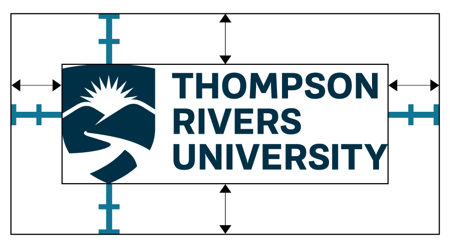
Left aligned logo: minimum width 1"
Make sure that the logo is surrounded by space equal to at least twice the height of the "T" in Thompson. Make sure that other graphic elements and text do not appear within the protected space.
Horizontal logo: minimum width 1.5"
Make sure that the logo is surrounded by space equal to at least the height of the "T" in Thompson. Make sure that other graphic elements and text do not appear within the protected space.
Don't …
- use the shield by itself without “Thompson Rivers University”
- change colours in the logo
- change opacity of the logo
- change the typeface
- place the logo on a dark or busy background
- stretch, squash, or skew the logo
- place the logo on an angle
- add a tagline or other text to the logo
- make the blue logo white

Don't … place the logo on a dark or busy background

Don't … change colours in the logo

Don't … change opacity of the logo

Don't … change the typeface

Don't … use the shield by itself without “Thompson Rivers University”

Don't … skew the logo

Don't … angle the logo

Don't … stretch or squash the logo

Don't … add a tagline to the logo

Don't … make the blue logo white. Use the correct reversed (white) version if you will be using the logo on a dark background.
Need more?
A Word template for letterhead is also available. See Downloads for branded templates for your next presentation, poster or report.
Download the TRU logoWolfPack logo
The new Wolfpack logo, released in 2017, is made of three wolves. Together, they form a fierce pack. The diversity between them celebrates the collective confidence and diversity of the university. Contemporary typography and colours are optimized for use in a range of traditional and new media.
Minimum size
Use the logo at a width of at least one inch.
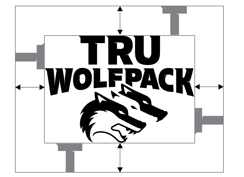
Protected space
Make sure the logo is surrounded by space equal to or greater than the height of the "T" in TRU. Other graphic elements and text must not appear within the protected space.
Don’t …
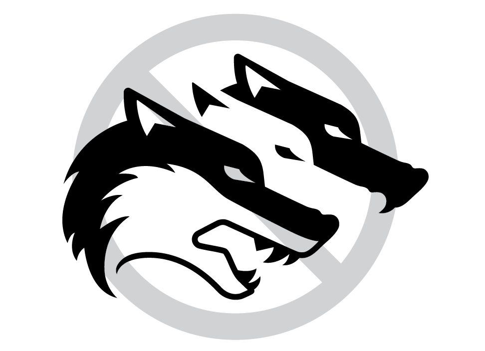
Don't … use the wolves by themselves without “TRU Wolfpack” wordmark
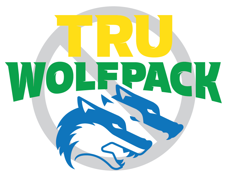
Don't … change colours or opacity in the logo
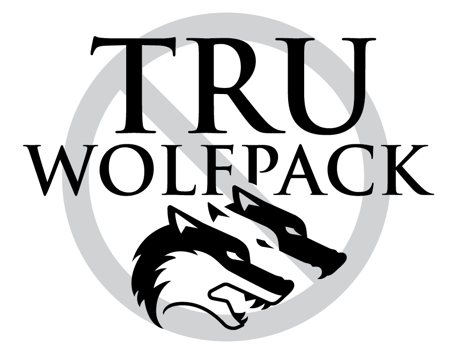
Don't … change the typeface in the wordmark
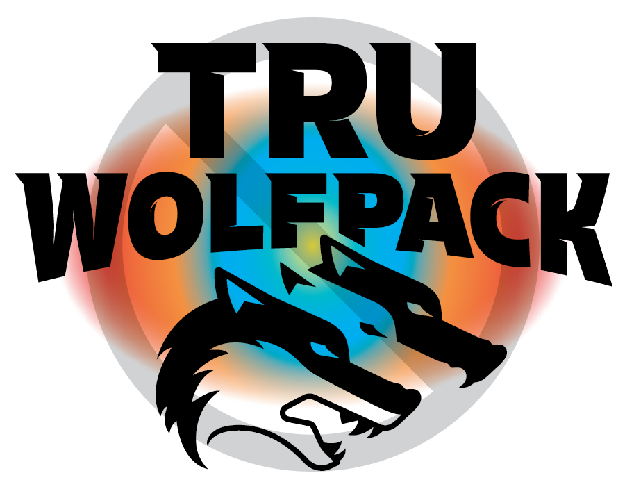
Don't … place the logo on a dark or busy background
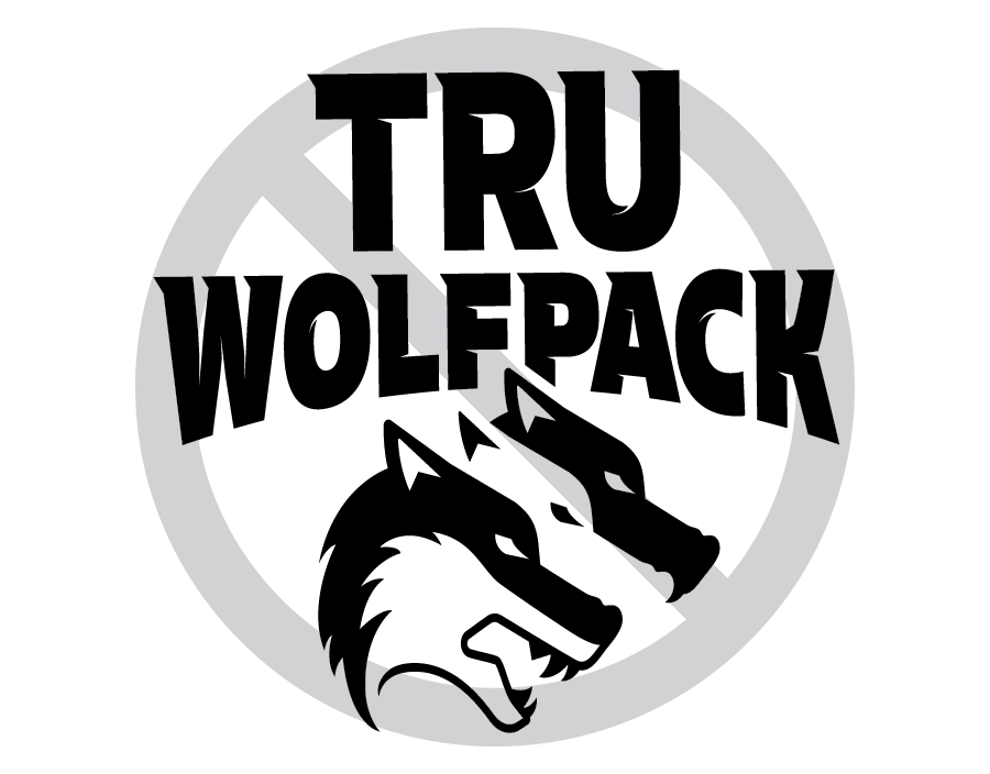
Don't … stretch the logo
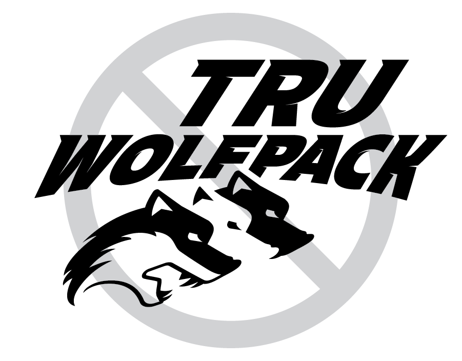
Don't … skew the logo
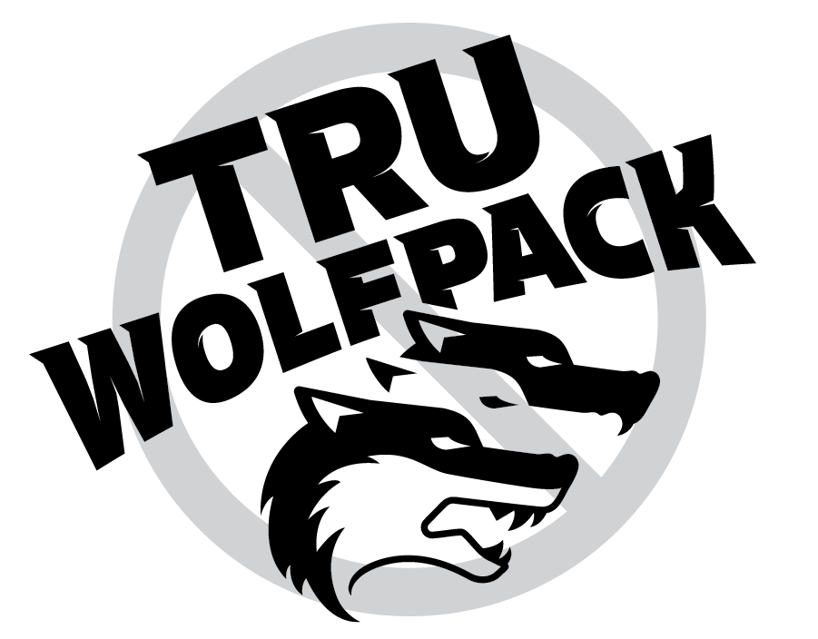
Don't … place the logo on an angle
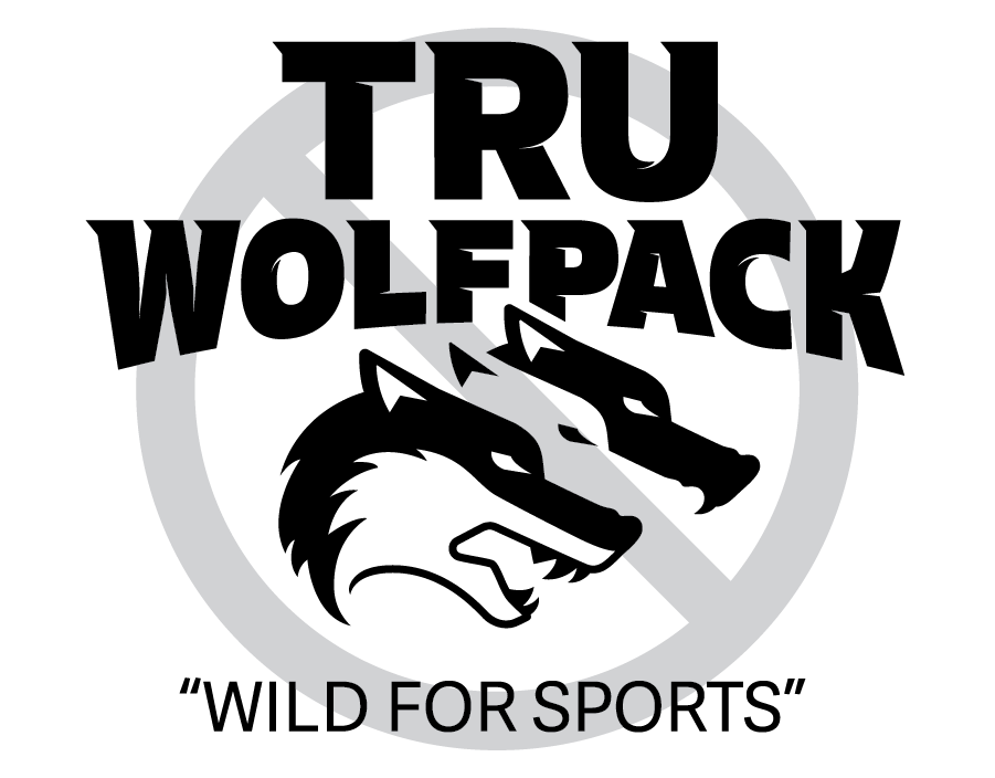
Don't … add a tagline or other text to the logo

